-
About Us
-
Business
-
Ethics & Compliance
-
Certifications
-
Careers
-
Investor Relations
-
Community
-
About Us
CI/BI
하이즈항공은 혁신과 도전으로 글로벌 경쟁력을 갖춘
대한민국 대표 항공기업입니다.
BRAND MARK
The HIZE brand mark signifies continuous growth, business expansion, and limitless ascent—one added to one, again and again.
HIZE Aero aims to evolve into the HIZE Group that leads a new paradigm by multiplying synergy through an UPGRADE + JUMP in the aviation industry.


We combined the “I” that represents me, the company, and HIZE with the “I” that represents you, our employees, and our customers, forming “We” as a symbol of shared growth.
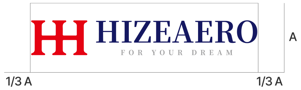
GRID SYSTEM
The grid system is the standard for maintaining a consistent image of the HIZE brand mark.
As a rule, the brand mark should be reproduced from official digital artwork. When digital data cannot be applied, such as exterior wall painting or other special applications, the grid ensures accurate proportions. Usage must be coordinated with the brand management team and follow the data included in this guideline.
COLOR SYSTEM
HIZE NAVY
- PANTONE
- 273C
- CMYK
- C100 M100 Y20 K30
- RGB
- R21 G24 B97
HIZE RED
- PANTONE
- Bright Red C
- CMYK
- C0 M100 Y100 K0
- RGB
- R230 G2 B18
Defined main and secondary colors serve as the base palette across media, design, document creation, and applications. These are HIZE’s primary color standards. Please use the specified values exactly as provided to ensure consistency.